


Keita Turner: Mixmaster of Style

Photography by Brad Bunyea.
New York-based design powerhouse Keita Turner is a master of layering—whether it’s colors, finishes, fabrics, or patterns—and uses her eye for style to create spaces that elevate the human experience.
How would you describe your design philosophy and style?
I am an interior designer whose business is about creating transformative, fashionably classic environments that uplift the human spirit. Using their lifestyle as a template, I design interiors that convey the inspirations, spirits, and habitudes of my clients. Design is all about suitability.

What is your background in design?
After graduating from Rhode Island School of Design, I moved to New York City to pursue a career in the fashion industry. Several years after establishing myself as a successful fashion designer in a very cutthroat industry, I decided I needed a major change in my career and lifestyle. I made the transition to interior design by studying at the School of Visual Arts and at the Pratt Institute. After working on both residential and commercial projects for Betty R. Turner Interiors, my mother’s interior design firm in Saint Louis, Missouri, I struck out on my own.
You were chosen to design a space in the Alden Parkes Showhouse in North Carolina. Will you explain the concept of a showhouse?
Designer showhouses are temporary designer showcase installations where we can push boundaries and stretch our creativity beyond the practical limitations and typical client-imposed budgets. Some designer showhouses are held in showroom or gallery spaces, but the majority of them are located in newly constructed or renovated homes and then put on the market for sale. Many are affiliated with charitable organizations, with proceeds from showhouse ticket sales going to support fundraising efforts. Because designer show houses are generally known as industry events where designers can present their most luxurious, over-the-top, and unusually bold designs, they make great venues for home decor and design enthusiasts to view the work of top local tradespeople and gather new interior design ideas or trends for their own homes.
What inspires your bold color palettes?
I first learned how to “see” color through my mother’s tutelage. As a classically trained fine artist, my mother taught me how to choose and use color naturalistically. She explained how artists recreate the conventional colors we see without actually imitating them at face value. I love bringing in colors from the endless combinations and possibilities nature provides. I also find wonderful color inspiration from the couture fashion houses and editorial fashion photography each season during fashion week.

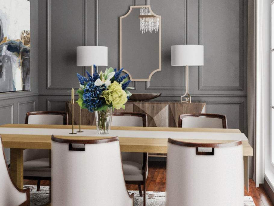
What is the secret to layering so many patterns and colors in one space?
I really think about the colors found in nature and how they coexist harmoniously, and then I translate that vision into an interior space. Once the color palette is determined, it’s a matter of specifying materials, textiles, and surfaces that will make the perfect cohesive marriage of balance, proportion, scale, line, and weight.
How did you go about doing this in the Alden Parkes Showhouse living room?
I chose the wallpaper first. I absolutely loved the yellow leaf-printed wallpaper by Anna French and Thibaut. This yellow-enveloped room makes me feel happy, optimistic, and lighthearted. After I had selected the wallpaper, I knew I wanted to introduce two matching olive-green velvet sofas. The yellow ended up being a perfect backdrop for the timeless furnishings we selected from Alden Parkes. One of our favorite pieces was the white-leaf-framed mirror. We redefined tradition by introducing some modern artwork hung asymmetrically and by tablescaping the classic chest-of-drawers with a mid-century-inspired table lamp.
What are your thoughts on coffee tables? You went in two very different directions in the Alden Parkes Showhouse.
Selecting the perfect coffee table can be tricky, even for a seasoned designer. For the living room, I knew I needed a large enough coffee table surface to accommodate seating from all four sides while providing the ideal distance from the edge of the sofas and chairs. I chose six glass bunching tables by Alden Parkes to create the perfect large surface. The glass top helps to keep the space from becoming too heavy and bulky. For the master bedroom sitting room, I chose a trio of modernist, solid-matte-black, geometric, triangular tables to counterbalance some of the traditional furnishings within the space.
Was the bed frame custom-upholstered?
Yes! We reupholstered an Alden Parkes bed frame in a printed Thibaut fabric to both complement and contrast the wallpaper in the room. It was a bold design decision to lay pattern on top of pattern, but the cohesive color palette and gold-leaf trim around the headboard kept the patterns from competing with one another.
What is your biggest design pet peeve?
My biggest pet peeve is walking into a home and seeing artwork hung way too high. Generally speaking, a piece of artwork should be hung at eye level with the center of the piece anywhere from fifty-eight to sixty inches from the floor. Of course, these rules may be adjusted for gallery walls.

What design changes have the most transformative power while being kind to the budget?
Repainting your home’s interior or exterior walls provides the most obvious transformation while also being budget friendly. I also believe upgrading or refreshing your throw pillows and linens, as well as incorporating green plants or indoor trees into your space, can have
transformative power.
What do you advise clients to splurge on?
I definitely advise my clients to splurge on the best-quality mattress, bed frame, and upholstered seating their budget will allow, because they will spend most of their time using these important home furnishings on a regular basis.
Do you have a couple of go-to paint colors you find yourself using over and over?
I try not to repeat the same colors too often or use the same colors from one client project to the next. However, some of my favorite white paints to use are Benjamin Moore’s Cloud White, White Dove, and Swiss Coffee, and Sherwin-Williams’s Alabaster.
Is it OK to mix finishes in the same room? How do you execute this while making the room look cohesive?
I consider myself somewhat of a mixmaster. Don’t be afraid to mix unconventional color combinations, patterns, textures, finishes, and furnishing styles authentic to or attributed to different eras. You’ll be surprised how well it works and makes for a more interesting layered interior.

What traits make you a good designer?
The desire to help make people’s lives more enriching and productive is a necessary trait to being a good designer. I personally understand the positive or negative effect an environment can have on the satisfaction or success of one’s life or business. Prior to going into business for myself, I transformed my residence into a personal oasis of serenity from my then stress-filled life. I quickly discovered that
my well-designed space went beyond just my personal satisfaction and had far-reaching influence on my friends and the people around me. Friends and guests would ask if I could create something special for their homes. That’s when I recognized the importance of improving human life and experiences through the designed environment.
What is the most recent thing you’ve experienced that has deeply inspired you?
I have found the resiliency and compassion of many Americans during these challenging times of uncertainty and unrest to be quite inspiring. It has been an amazing show of hope and love to witness the individuals and entities who are in a position to support those disproportionately affected by the pandemic step up to the plate to help the country get back to a better, healthier place.
For more info, visit keitaturnerdesign.com